The painters have been gone for ten days and I've only hung one picture.
There is that vibe about a freshly painted wall, with no knicks or mars that I'm simply appreciating. That and the fact that I want to hammer the nail only once, so I'm allowing myself the time.
I'm so grateful for the Interior Designer's eye and guidance when it came to choosing the colour for our main floor. The following pictures below do not do the real life feeling justice.


If I were to look at the bagua just for this room it may appear as though I've not considered Feng Shui at all. However, as I mentioned in the Refreshing Your Home's Energy with Colour, there is definitely room for interpretation, and in my opinion room for Intention.
The bold Spanish style Red (Fire) , the deep, dark Grey (Water), the contrast neutral Smoky Taupe (Metal) make this space feel warm and inviting.
I'm not afraid of bold colours, and during our initial consultation with the designer I had in my mind's eye a blue where the red now resides. I wanted to draw from the blue in a picture I had and felt it would be most perfect. Up until a week before the painters arrived, every time I looked at that wall I saw the blue, I was on the verge of calling and changing colours.
Wood Elements:
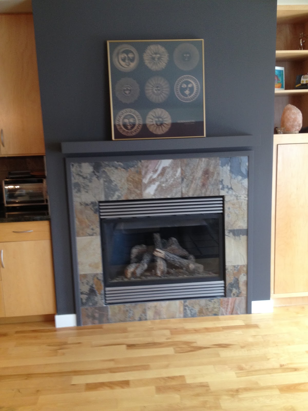
Hardwood Floor (literal wood)
Hardwood Floor (striped, linear pattern)
Maple Cabinets
Maple Door
Maple built in shelves
Lots of Plants
Faux logs in Fireplace
Fire Elements:
South Facing Windows
Lighting fixtures
Fireplace
Gas Stove
Artwork depicting the sun
Earth Elements:
Brown fabric Couch
Square Slate back splash
Square slate tiles fireplace surround
Square shaped wall unit
Square design on area rug
Room screen with gold
Metal Elements:
Stainless Steel appliances
White sheers
Circular plant stands
Water Elements:
Sink
Dishwasher
Large Windows
Diffuser
Black book case
The addition of our colours helps to balance out the elements in the space.
The Red wall (fire) helps to control the wood dominance; while the addition of the Grey (water) helps to nourish Wood energy overall. To keep everything in balance.
Back to intention. Red is also the colour of communication, as this is our kitchen and dining room, and I love to entertain I see the red as a support of warm and lively conversations with whomever gathers here. The Grey light banks above add that water vibeage to keep the communication from getting to "fiery" :)
There is that vibe about a freshly painted wall, with no knicks or mars that I'm simply appreciating. That and the fact that I want to hammer the nail only once, so I'm allowing myself the time.
I'm so grateful for the Interior Designer's eye and guidance when it came to choosing the colour for our main floor. The following pictures below do not do the real life feeling justice.


If I were to look at the bagua just for this room it may appear as though I've not considered Feng Shui at all. However, as I mentioned in the Refreshing Your Home's Energy with Colour, there is definitely room for interpretation, and in my opinion room for Intention.
The bold Spanish style Red (Fire) , the deep, dark Grey (Water), the contrast neutral Smoky Taupe (Metal) make this space feel warm and inviting.
I'm not afraid of bold colours, and during our initial consultation with the designer I had in my mind's eye a blue where the red now resides. I wanted to draw from the blue in a picture I had and felt it would be most perfect. Up until a week before the painters arrived, every time I looked at that wall I saw the blue, I was on the verge of calling and changing colours.
Wood Elements:
Hardwood Floor (literal wood)
Hardwood Floor (striped, linear pattern)
Maple Cabinets
Maple Door
Maple built in shelves
Lots of Plants
Faux logs in Fireplace
Fire Elements:
South Facing Windows
Lighting fixtures
Fireplace
Gas Stove
Artwork depicting the sun
Earth Elements:
Brown fabric Couch
Square Slate back splash
Square slate tiles fireplace surround
Square shaped wall unit
Square design on area rug
Room screen with gold
Metal Elements:
Stainless Steel appliances
White sheers
Circular plant stands
Water Elements:
Sink
Dishwasher
Large Windows
Diffuser
Black book case
The addition of our colours helps to balance out the elements in the space.
The Red wall (fire) helps to control the wood dominance; while the addition of the Grey (water) helps to nourish Wood energy overall. To keep everything in balance.
Back to intention. Red is also the colour of communication, as this is our kitchen and dining room, and I love to entertain I see the red as a support of warm and lively conversations with whomever gathers here. The Grey light banks above add that water vibeage to keep the communication from getting to "fiery" :)
No comments:
Post a Comment